Fall is hands-down one of the most beautiful times of year for family photos. At least that's my opinion as an Atlanta family photographer. The golden light, colorful leaves, and cozy layers create a natural backdrop that’s warm and timeless. But when it comes to choosing what colors to wear? There is no shortage of options, and that’s where many families get stuck.
The good news? Picking the right colors for your fall session doesn’t have to be stressful. With a few thoughtful choices—and a little inspiration from families who’ve nailed it—you’ll feel confident and look amazing in every frame.
In this article, we will explore classic fall color palettes and examine actual outfits of clients who absolutely crushed it! We’ll break down what works about each palette and why, so you can be confident when choosing the best colors for fall family photos.

Choose Your Color Palette First
Before you think about neutrals or accessories, start by choosing a color palette that feels right for your family. I've put together a number of popular fall color palettes below. Don't worry, I give tips for how to choose at the end! For now, let's explore some of the best color palettes for fall family photos.

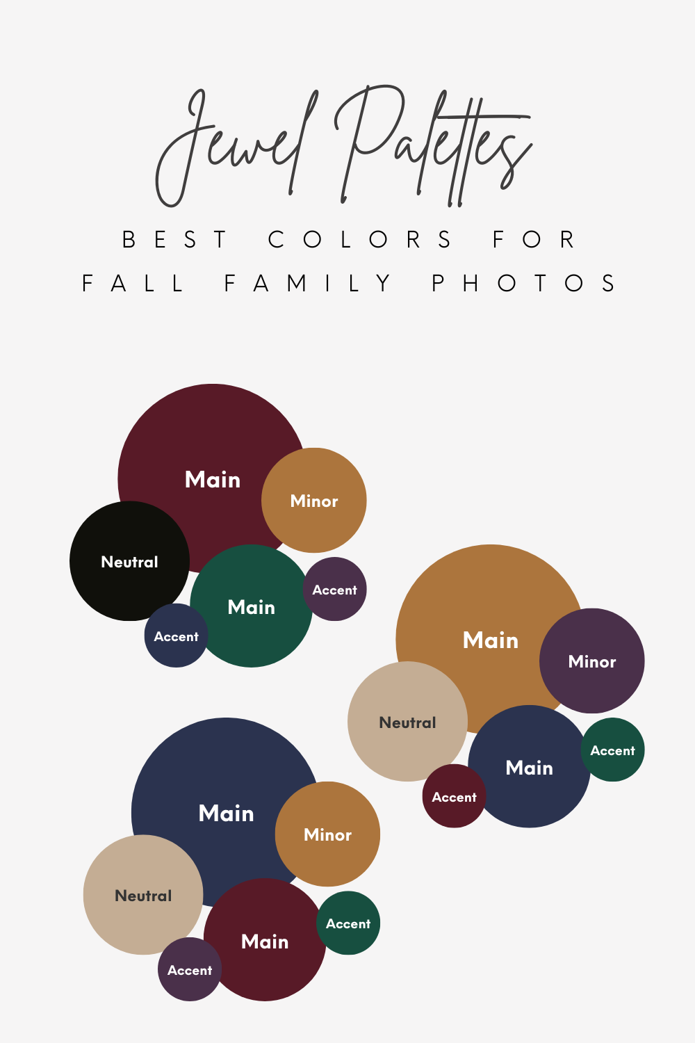
Jewel Tones
Rich, vibrant, and bold. Think emerald, deep plum, sapphire, and ruby. Jewel tones bring energy and elegance to fall photos and pop beautifully against golden light and autumn leaves. Great if you love color and want a timeless, dramatic look.


Deep Blues, browns, & green
This Atlanta family chose a deep emerald green that was perfect for Mom and complemented beautifully by the sapphire blue on the boys. They coordinated with neutral browns that lent an overall warmth to their color palette. Jewel tones were perfect for this red-haired family and popped boldly against the warm fall backdrop. Even the dog matched the color palette!
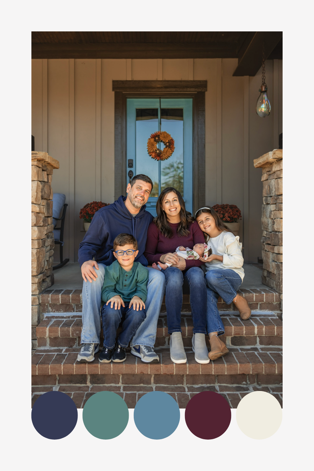
Blues, Berry, & green
Deep berry pairs beautifully here with sapphire blue. This family complemented their jewel tones with more neutral blues and cream. Even though it wasn't part of their outfit, the marigold and berry-colored wreath on their front door was the perfect pop of brightness, and tied in their outfits with their location perfectly. By choosing colors they like to use in the decor around their home, this family ensured their images would match when printed and displayed.
bold, bright, & colorful
While technically not all jewel tones, the boldness and brightness of the colors chosen by this family ensured they would stand out in this peaceful fall setting. Mom's dress and Dad's shirt colors can be found in the pattern of their son's shirt, ensuring a cohesive color palette perfect for fall.

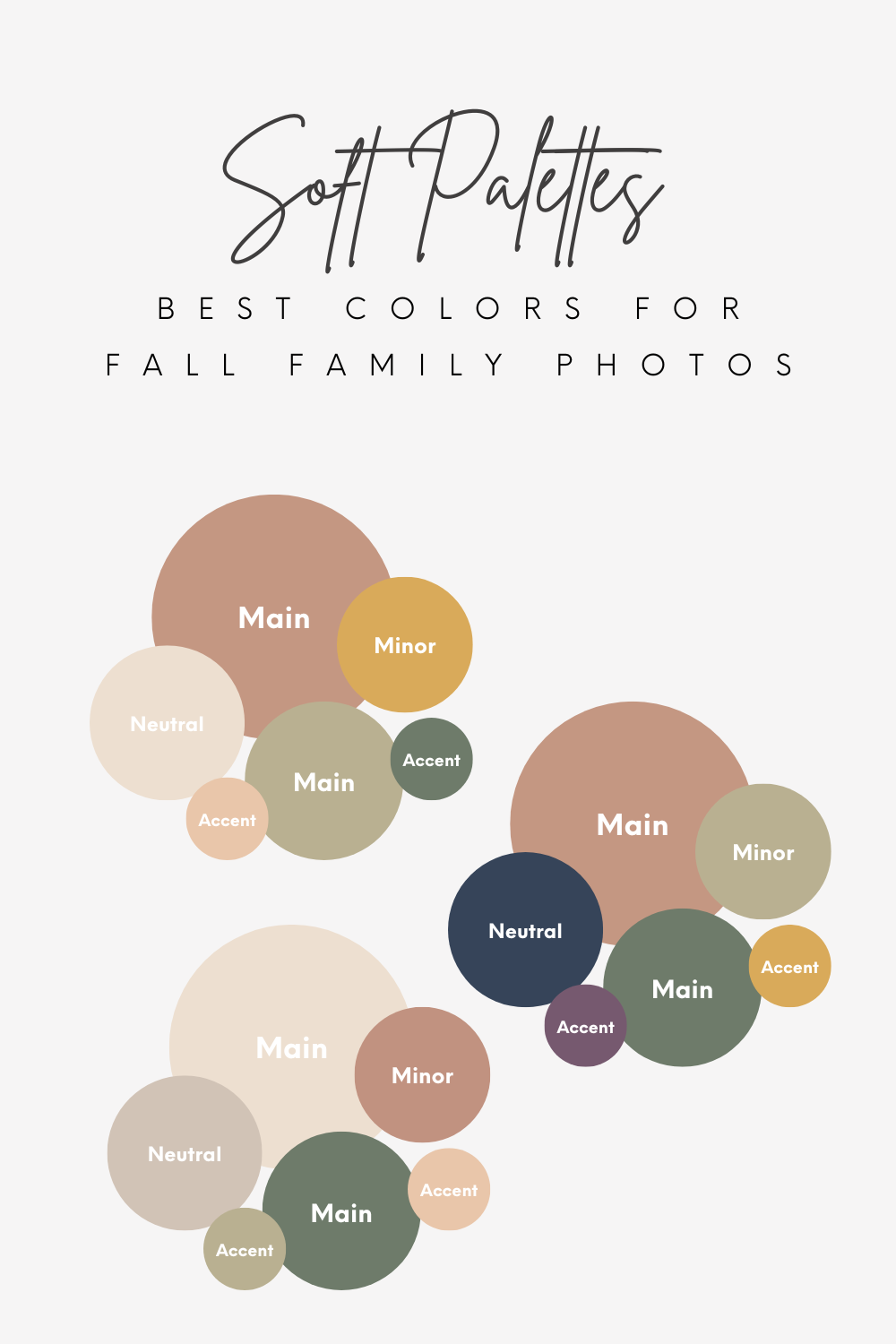
Soft Tones
Dreamy and subtle, with shades like dusty rose, soft sage, muted blues and purples. Soft palettes offer a romantic and light-filled look, ideal for families who want a gentle, calming vibe. Colors are often warm and muted. Best paired with warm browns or darker blues for a slightly bolder or moodier look.
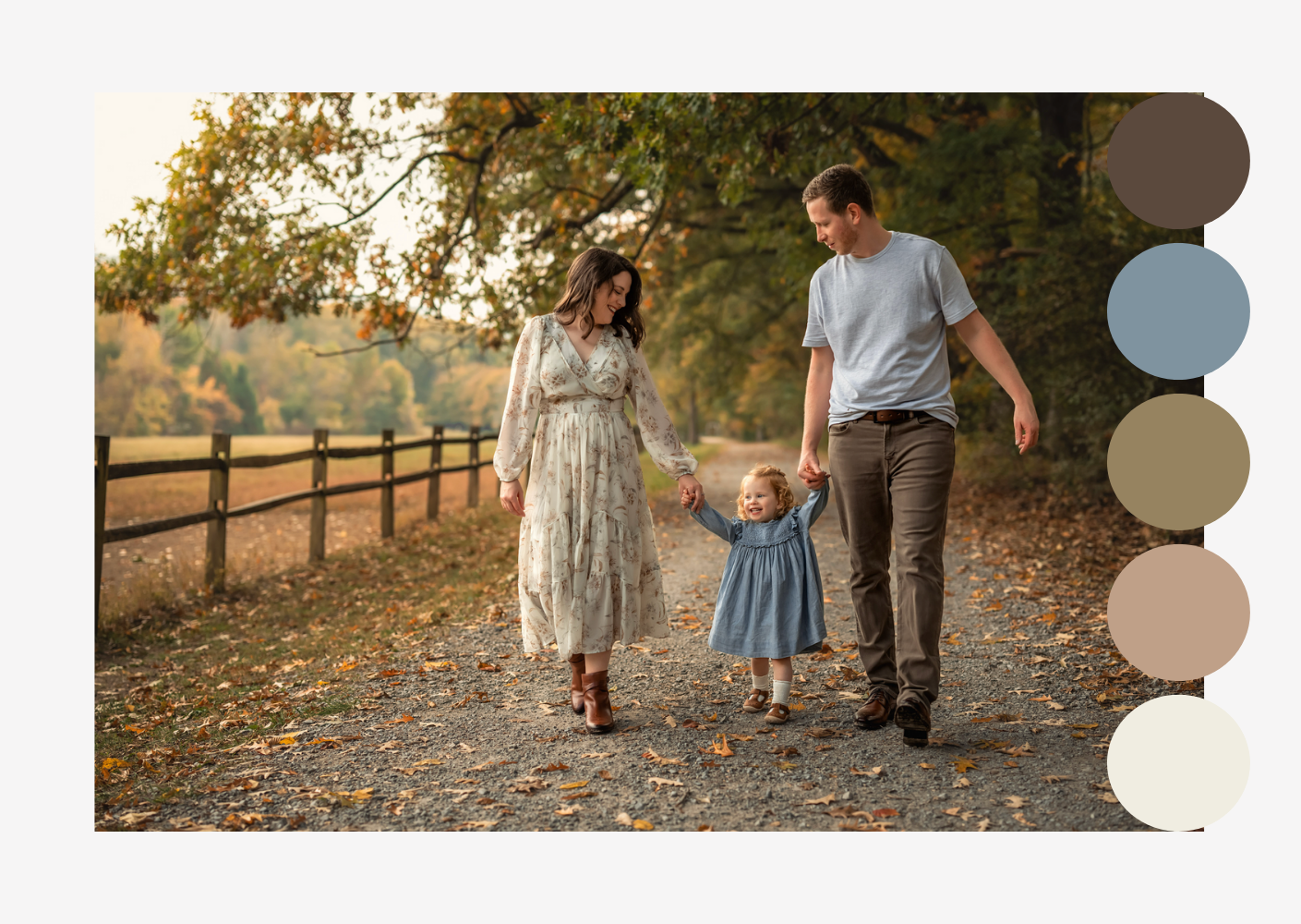

Soft neutrals with a pop of blue
This soft palette was perfect for making the family look at home in this natural location. It was the perfect complement to their surroundings and a great example of choosing colors that blend with your location versus colors that stand out. Both are beautiful and have their place depending on your style! The pop of blue on the little girl was just the right amount of playfulness and complemented the soft neutrals while providing a bit of contrast.
browns and blues with a hint of sparkle
This family chose to work with mostly browns and blues for their color palette. You can easily create variety within 2 chosen colors by incorporating different shades of each color and through different fabric textures. Little sister's dress contained a hint of gold sparkly thread that provided the perfect fun contrast and pop.


Brown and pink
As parents to two little girls, it's easy to see why pink was a primary choice for their chosen fall color palette. Browns always complement pink beautifully, and the pop of deep blue created a lovely contrast. I especially love how Mom and Dad wore their brown and blue in a way that contrasted each other rather than matched. It really helped to create balance in their family photo!
blush and navy
This color palette is a little more on the moodier side of soft, but I felt it still belonged here best since the blush color was one of the main colors in this palette. This is a perfect example of choosing Mom's dress first and then building the colors of everyone else's outfits from the pattern of Mom's dress.
Shades of blush
Technically, this was a summer session, but I thought they did a great job with a soft palette. The different shades of blush looked beautiful on all the girls and coordinated beautifully with Dad's neutrals. I included the deeper green in this palette to show how your chosen location can also be part of your color palette, even if you aren't wearing it!


Earthy Tones
Warm and grounded, with colors like terracotta, olive, rust, and mustard. Earthy palettes blend seamlessly with outdoor settings and feel cozy and organic. They work especially well with the natural colors of the fall season. Use lighter shades for a softer look and darker shades for a more moody vibe.


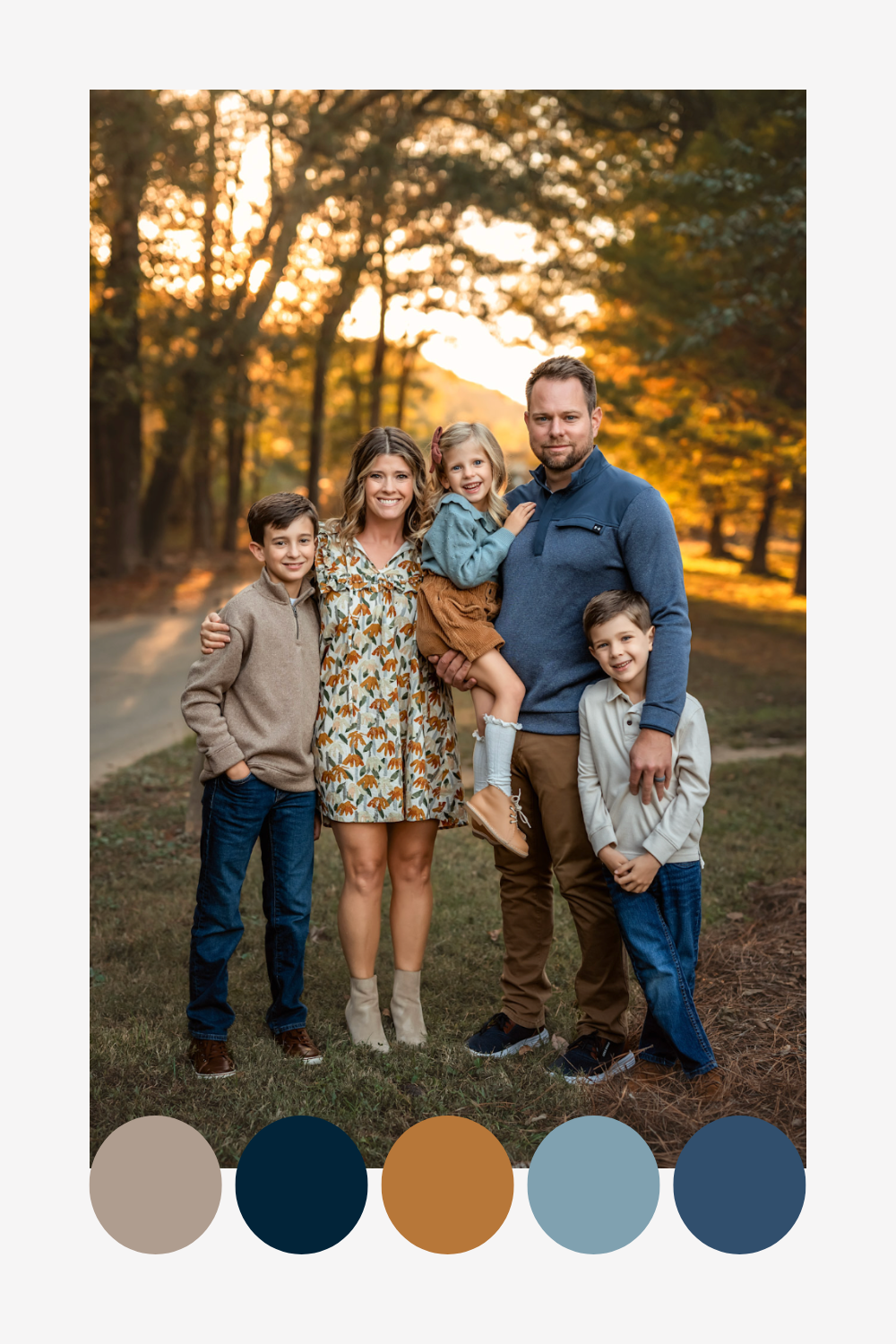
Orange & green with a pop of blue
Mom looked stunning in her orange dress that perfectly complemented her red hair. It paired perfectly with Dad's green sweater. The pop of light blue on the little boy lightened their whole look with the perfect touch of playfulness!
green, brown, & blue
The shade of blue and green chosen by this family were perfectly suited to the fall foliage. The brown shades of their neutral pieces helped to pull everything together in a very cohesive look.
Shades of blue with a pop of mustard
This family did an excellent job of coordinating without matching. The boys in blue jeans and neutral shirts was the perfect contrast to dad's blue sweater and brown pants. Mom looked stunning in a patterned dress with pops of mustard and blue-greens. And little sister shone in her brighter blue shade.
Green, yellow, blue, & brown
I especially love the earthy tones chosen for these siblings. Each one is in a different color, but together they create a beautiful palette that coordinates perfectly.
green, blues, & dark rust
Mom was the star of the show in a beautiful green dress that perfectly mirrored the early autumn greens. As the only one in that color, she both coordinates with and stands out from her husband and sons in their blues. The dark rust and neutral browns provided another complementary pop of color to warm up this palette ever so slightly.


Moody Tones
Deep and dramatic, with tones like charcoal, forest green, maroon, and navy. Moody palettes are perfect for cooler, cloudier days, peak fall color, and urban backdrops. They feel modern, rich, and artistic. Many of the above palettes can be made moodier simply by choosing darker shades or pairing with darker neutrals. If you want moody photos, your chosen location and time of day for your session will play a big part in achieving that look. Look for an area with plenty of shadows or wait until the very end of golden hour and into blue hour.
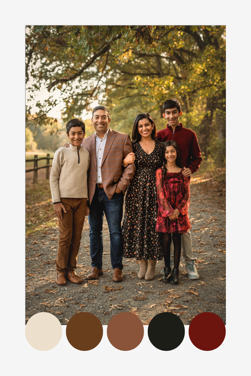

black, dark red, and brown
This is another perfect example of starting with Mom's dress and coordinating everyone else with it. It is also a great example of mixing and matching patterns. The smaller floral pattern on Mom's dress works well with the larger floral pattern on Daughter's dress. Dad's jacket has a subtle plaid in complementary colors, and Little Brother's sweater brings variety in neutral with the bold quilted texture.
Bold in Blue
Mom's rich velvet dress is what takes this out of a soft palette and more into the moody category. The dark neutral blues on her boys complement her dress perfectly and allow her daughter to shine in her pop of a darker blush color. The lighter blue shirts provide just the right amount of contrast to keep everything cohesive and visually interesting. Finally, bringing the blush color into Mom's accessories was the perfect way to blend the colors in this palette!
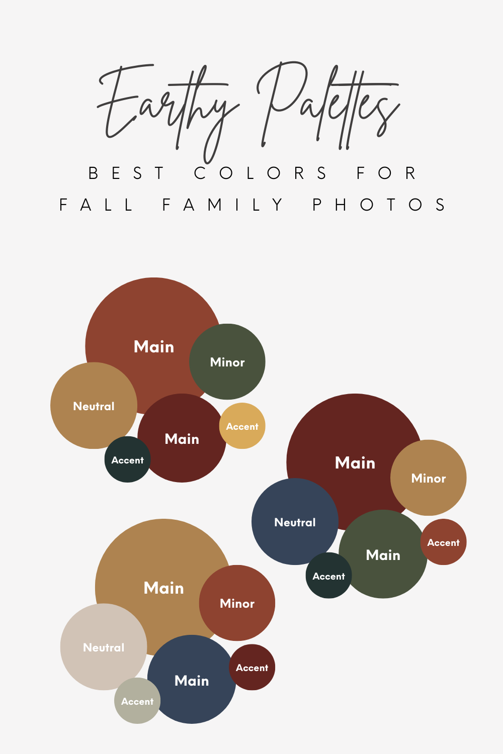
Monochrome Palettes
A favorite for flexibility and ease. These palettes focus on varying shades of one or two colors. Use any horizontal line from the monochrome chart as a standalone palette, or mix 2–3 lines for more variety. These work beautifully when you want a sleek, cohesive look with just enough contrast.
Monochrome Mixes
Another great feature of this chart is that you can create a cohesive palette by drawing a line through the colors both vertically and diagonally! The bottom monochrome line makes for great neutral options to pair with any of the other colors
Try using this chart to create palettes by combining 2-3 darker shades of one line with 2-3 lighter shades of another line. For a softer palette, choose 2-3 lighter shades of one line and 2-3 lighter shades of another line. For a moodier palette, choose 2-3 darker shades from two lines.

Here's A Tip For Using A Monochrome Color Palette For Family Photos
Build variety in your outfits through different textures and shades! It will help to keep your palette visually interesting and not flat or one-note.
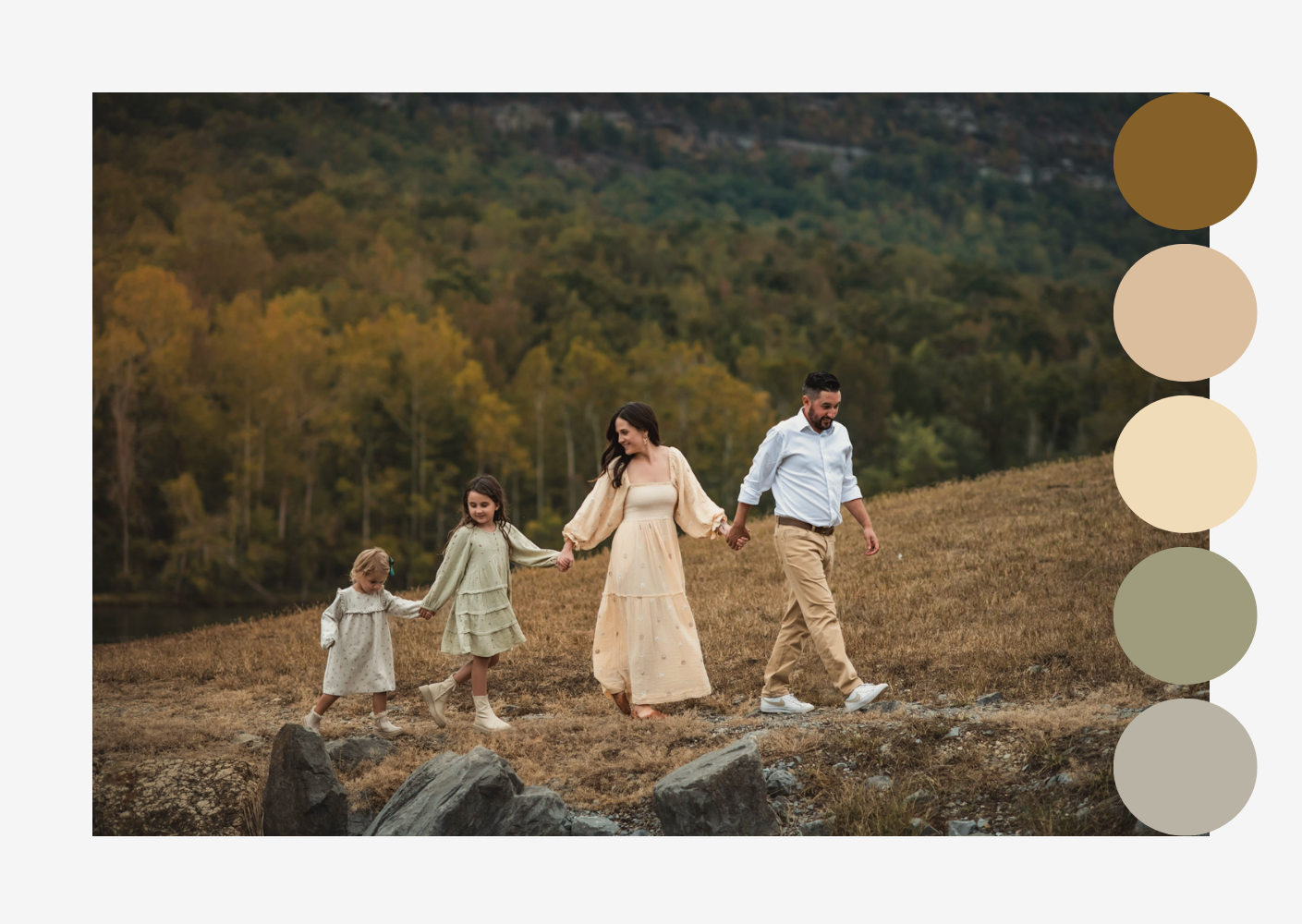
Mostly Neutral Monochrome
This family chose mostly muted, neutral tones found in nature. It perfectly coordinated with the fall colors found at their cloudy fall family photo location.
Tips for choosing the best color palette for your family photos
- Start with colors you love. You’ll feel more comfortable and confident.
- Look around your home and pick tones that complement your decor. That way, your printed photos will make everyone think you hired an interior decorator.
- Consider the vibe you want. Bold and energetic? Soft and sweet?Natural and relaxed? Your palette sets the mood.
- Think about your location. What colors are found in nature? Do you want to compliment them or stand out? Your photographer can help guide you based on your location.


Want to know where to find more inspiration for the best colors for fall family photos?
My favorite place to look is on Pinterest. You can find a palette in any combination of colors! A handy trick I learned was to just start adding any palettes that you like to a new board. After you've pinned a good amount, go back and look at what you pinned. Did you consistently choose similar colors? Are your picks mostly darker tones or lighter tones? That could be a great way to find what colors and color combinations you're drawn to if none come to mind immediately.
How to Build a Color Palette for Fall Family Photos From Scratch
Another favorite tip of mine is to choose an outfit that you really want to wear for your fall family photo session. Or perhaps you have the perfect outfit for one of your children already picked out. Start with the colors found in that outfit and build from there! Keep it simple with 1 or 2 main colors and add 1 or 2 accent colors. Add variety by using different shades of your chosen colors and using different textures in your fabrics.
That's how I picked out our outfits for my own family photos a couple of years ago! I wanted a more moody look and to wear a special dress from my Client Closet. I chose a textured dress for my daughter from the colors in my patterned dress and another textured sweater for my husband. We kept our neutrals dark in black and browns with a pop of light in the lighter flowers and my daughter's knee socks.

Once you've chosen a palette, you can start building outfits around your chosen tones.
Here are a few best practices for building the perfect fall family photo outfits!


Mix in Neutrals Thoughtfully
Once your main colors are chosen, neutrals can help round out everything else. Shades like cream, tan, oatmeal, gray, and even denim help balance bolder colors and give each outfit breathing room. Think of neutrals as the supporting pieces—great for any outfit pieces not already in one of your main or accent colors.
Coordinate, Don’t Match
Gone are the days of everyone wearing jeans and white shirts. (Thank goodness!) Instead, think about creating a coordinated look that allows each person’s style to shine. Vary the tones and textures across outfits to create depth and visual interest. Knits, linen, denim, and corduroy are especially great for fall.
Keep It Comfortable and Layered
Fall weather can change quickly. Layers like cardigans, hats, or scarves not only add visual interest but also keep everyone comfortable. Avoid anything too tight or fussy—kids especially do best in outfits that let them move freely and feel good.

Knowing what to wear is only half the battle...
Choosing what not to wear is just as important when planning your family's outfits for fall photos. In this article, I break down some of the more common fashion faux pas and share why you should steer clear.
Bringing It All Together
Whatever palette you choose, the most important thing is that it feels true to your family. The right colors highlight your personalities, complement your surroundings, and bring a sense of harmony to every image. When colors and connections come together, that’s when your fall family photos become timeless keepsakes.
Don’t Forget, Styling Help Is Available
One of the best parts of working with me? Styling help is always part of the experience! You’ll get outfit guidance and can even use dresses from my complimentary Client Closet. Because beautiful photos should be fun and easy—from start to finish!
If you're ready to start planning your perfect fall family photos in Chattanooga, send me a message to start the conversation!


Pin these to remember later!


Hi, I'm Christian!
(Michelle is my middle name) I’m a Marietta photographer who makes it fun and easy to create beautiful photos. I help families feel comfortable and confident in front of the camera through a guided, relaxed experience.
The result is beautifully polished images that reflect your family and are meant to be enjoyed for years to come.
If you’re looking for a seamless experience and photos you’ll love living with, you’re in the right place. Let's connect!


